Zelle
“This is How Money Moves”
Faced with the rising popularity of P2P payment platforms like Venmo, the big banks recognized the need to innovate and compete in the digital payment space to reclaim market share. We partnered with them over three years to create a “Venmo killer” which offered enhanced security, seamless integration with existing banking services, and a user-friendly interface to attract users away from competing platforms.
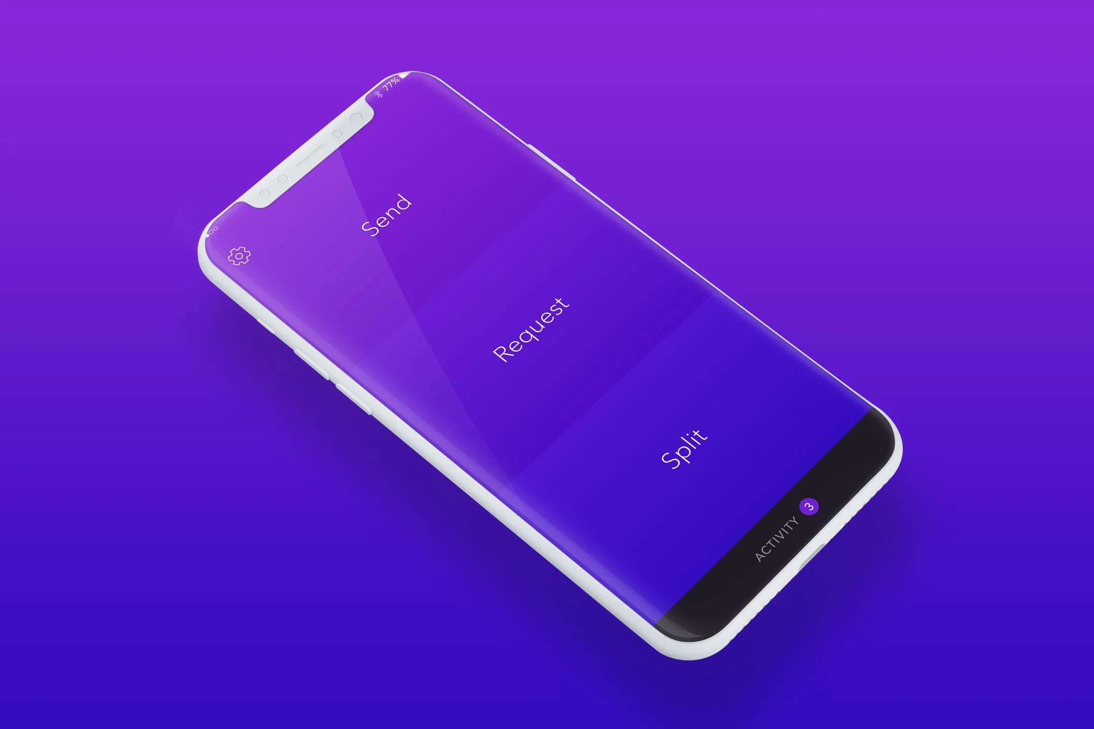
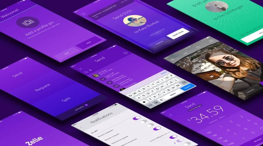
In designing the Zelle brand, we intentionally departed from traditional bank colors, opting for a bold purple hue that stood out in the financial landscape. This deliberate choice aimed to differentiate Zelle from other banking services and signal its modern, user-friendly approach. We prioritized simplicity and ease of use, ensuring that the platform's design was intuitive and accessible to a wide range of users. By embracing a vibrant color scheme, large profile pics, and emphasizing user-centric design principles, we aimed to make Zelle a standout player in the digital payment space, appealing to both tech-savvy individuals and those new to digital banking.
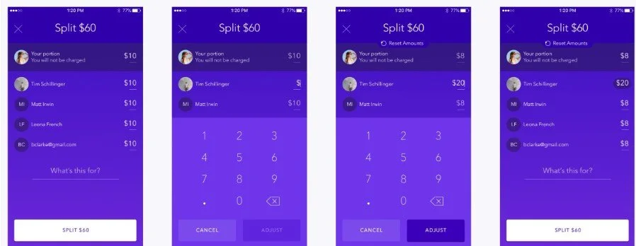
The split pay feature (featured above) was purposefully crafted to cater to first-time peer-to-peer (P2P) payment users, ensuring a smooth and intuitive experience. With a user-friendly interface, individuals can effortlessly divide expenses among friends or family members with just a few taps, eliminating the need for manual calculations or awkward conversations about financial obligations.
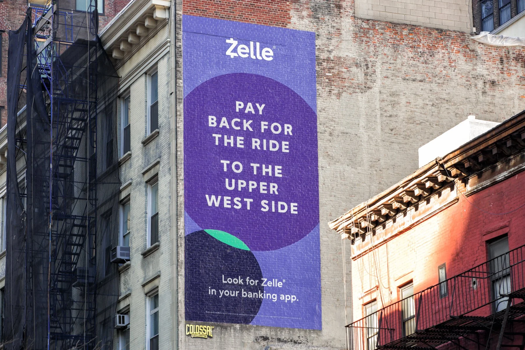
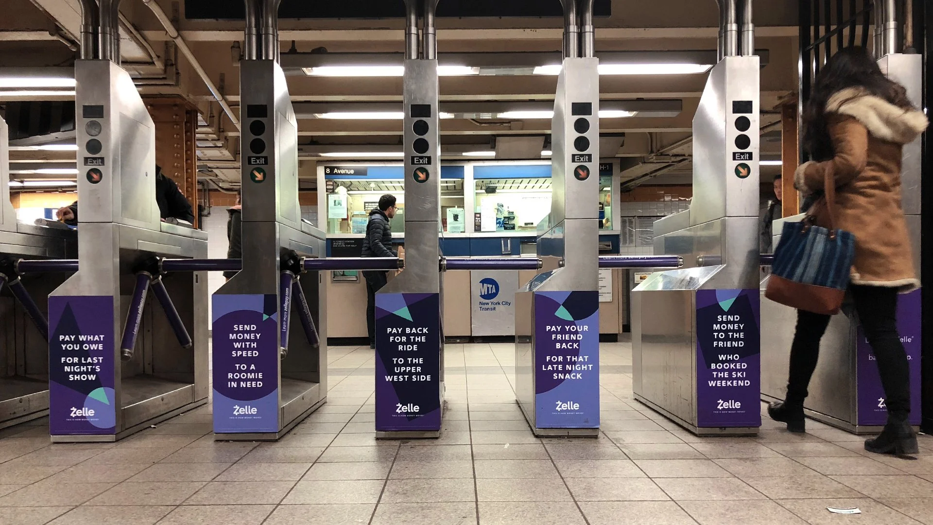
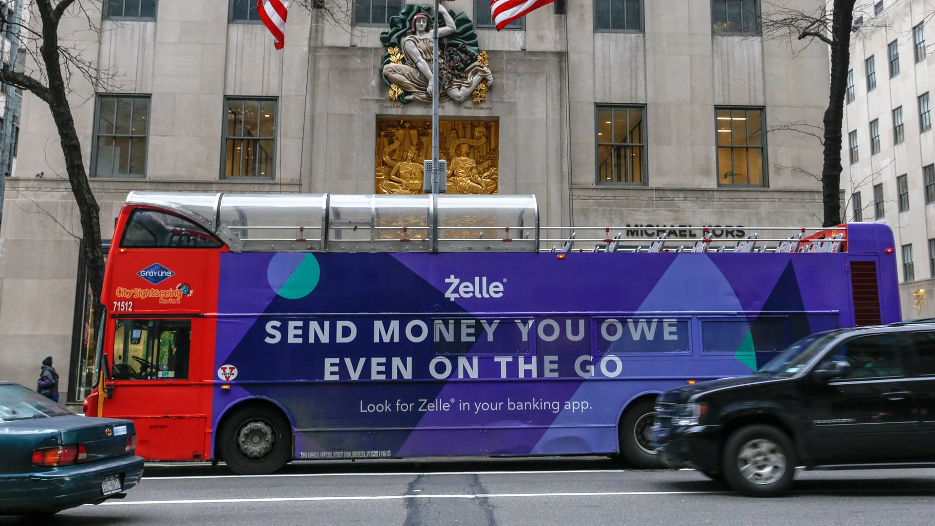
Expanding the Zelle message through traditional media, we employed a unified brand design inspired by the app's seamless functionality. Rhyming couplets were strategically utilized to evoke the fluidity and ease of money transfers facilitated by Zelle. This cohesive approach not only reinforced the brand's identity but also resonated with audiences, effectively conveying the convenience and efficiency of using the Zelle app for peer-to-peer transactions.

